How to Read a 3D Percent Returns Chart
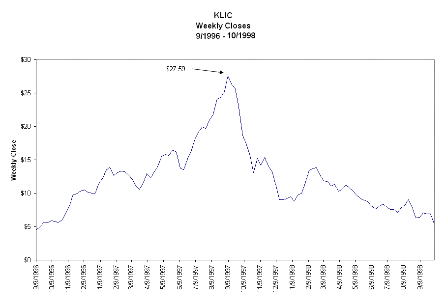
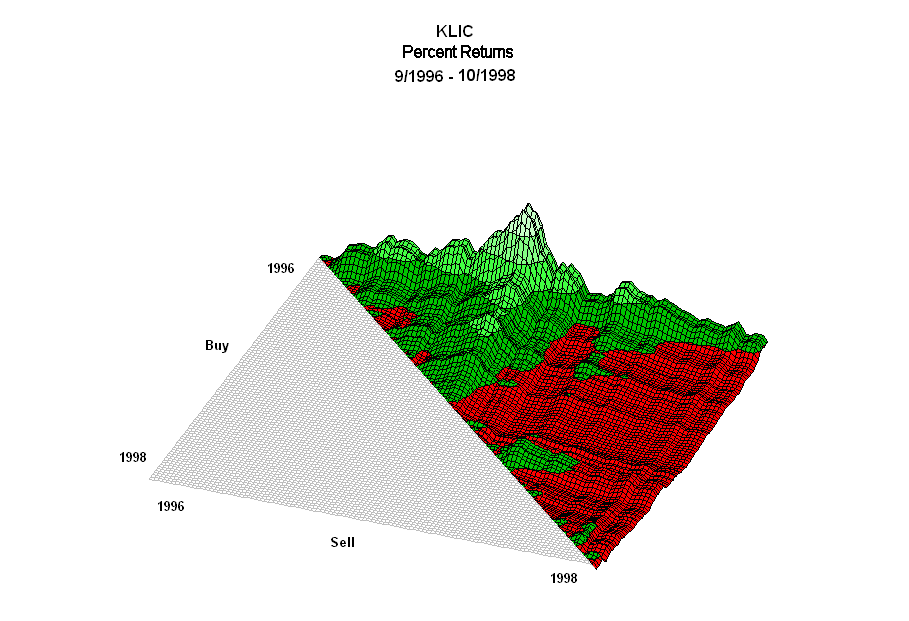
The second chart shows a 3-dimensional representation of percent returns for the 5,886 buy and sell combinations based on weekly closes for a Kulicke and Soffa Industries (KLIC) price series from September 9, 1996 to October 5, 1998, which is one complete price cycle. The upside peaks at $27.59 and the downside follows.

The cycle included 109 weekly closes for 5,886 (109*108/2) buy and sell combinations of which 2,501 (42.49%) were profitable and 3,385 (57.51%) were unprofitable.
The 3D percent winners chart shows the returns of each of the 2,501 profitable trades (green) and the 3,385 unprofitable trades (red). Most of the profitable trades occur for the buy upside and sell upside trades. Most of the unprofitable returns occur for the buy downside and sell downside trades and some losers are buy upside and sell downside trades.
How to Read the 3D Percent Returns Chart
The buy axis runs from the back (1996) to the front (1998) of the chart. The sell axis runs from left (1996) to right (1998). The buy axis and the sell axis form the floor of the chart. No trades can occur in the gray area because the buy date is after the sell date or the sell date is before the buy date. The pattern of positive returns looks like a mountain range whose elevations are directly proportional to the magnitude of the percent returns. The negative returns lie below the floor and appear as shallow scooped-out valleys. The back left corner of the floor is the return for the first (lowest) buy price and its first sell price. The back right corner is the return for the first buy price and the last sell price.Buy prices start at the lowest price of the series and increase to the peak along the buy price axis. After the peak price, the buy prices tend to decrease. The first (lowest) sell price is at the left side of the sell axis. Sell prices increase to the peak sell price and then decrease to the last sell price which is located at the right side of the sell axis.
The buy upside and sell upside trades are in the back left of the chart. The buy upside and sell downside trades are in the back right. The buy downside and sell downside trades are in the front right of the chart.
If you track the returns for one buy price, you will see the returns move up and down as the sell prices moves from left to right. The highest peak on the chart is the return for the first (lowest) buy price and the peak sell price. As you move from back to front on the buy axis, there are fewer trades for each buy price. And you can see the ridges of returns across sell prices for a given buy price.
The chart also shows the returns for a given sell price as you move from the first to the last buy price. For example, locate the peak return and follow the ridge of returns from the back to front of the chart. The peak return occurs for the first buy price. The lowest return, located next to the diagonal edge, occurs for the buy price just before the peak sell price. For all sell prices, the returns tend to decrease as buy prices increase on the upside.
Related Articles and Map Maker
Analyzing Price Upsides and Downsides
3D Surface Chart of Returns: Upside Price Pattern for Amazon
3D Surface Chart of Returns: Upside Downside Price Pattern for Chipotle Mexican Grill
Cyclical Price Pattern - An Opportunity to Make Money
Cyclical Price Return Calculator
Stock Return Calculator for Profitable and Unprofitable Buy Prices
Stock Return Map Maker - See Patterns of Winners and Losers

